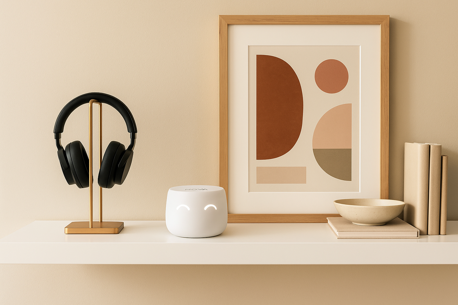
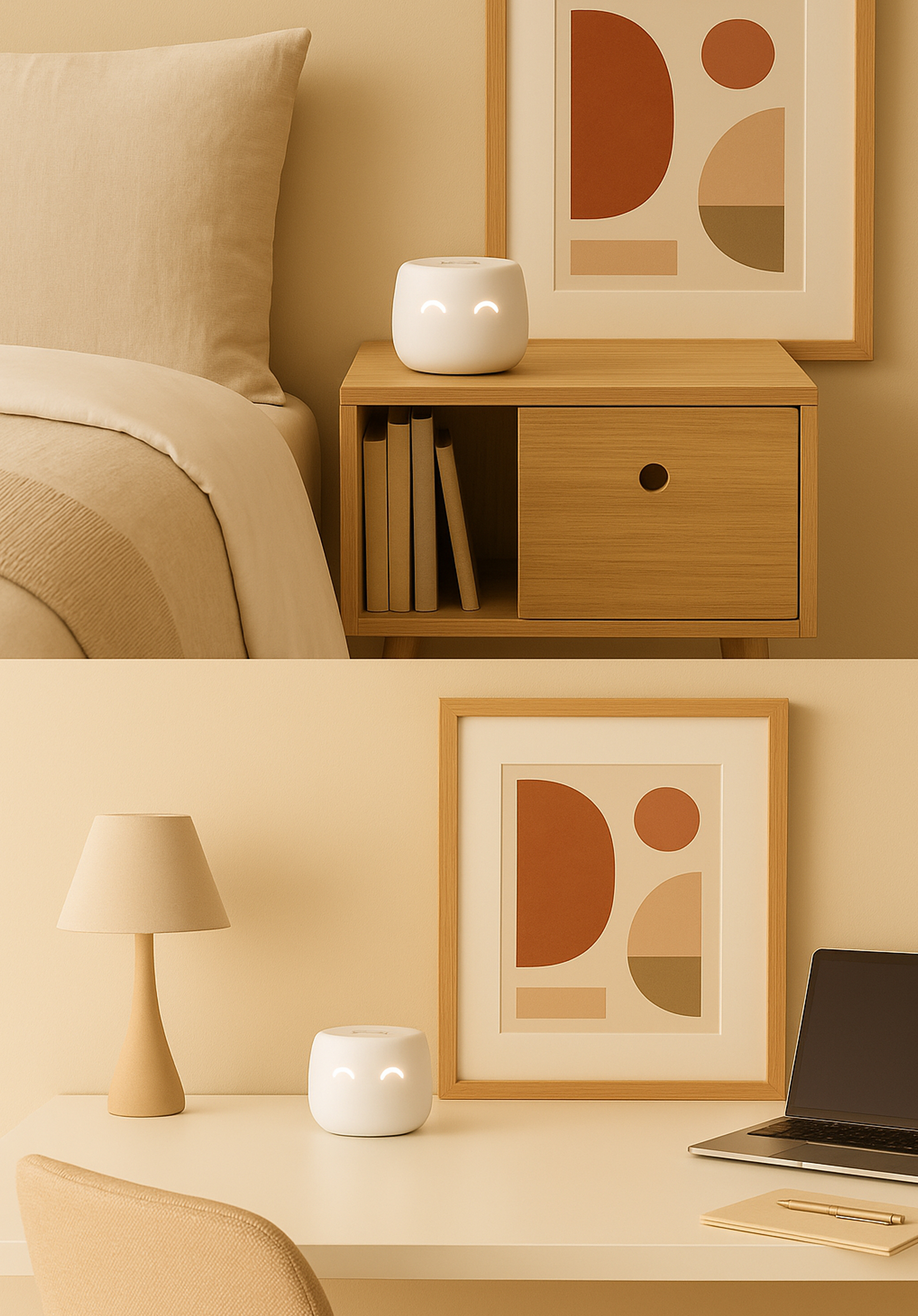
NOVA — Smart Home Security Redefined
NOVA brings enterprise-level protection into an elegant, minimalist home device. My role involved shaping its visual identity, defining the product experience, and creating a seamless app ecosystem around it.
NOVA brings enterprise-level protection into an elegant, minimalist home device. My role involved shaping its visual identity, defining the product experience, and creating a seamless app ecosystem around it.
User research, prototyping, UI design
Design system creation
Visual direction and brand development
Increased app retention and engagement
Reduced design-to-development turnaround
Enhanced conversion across NOVA’s digital platforms
The challenge was to design protection that feels approachable and human — not intimidating or technical. NOVA’s identity had to express both trust and simplicity, ensuring people feel in control without needing to understand every detail.
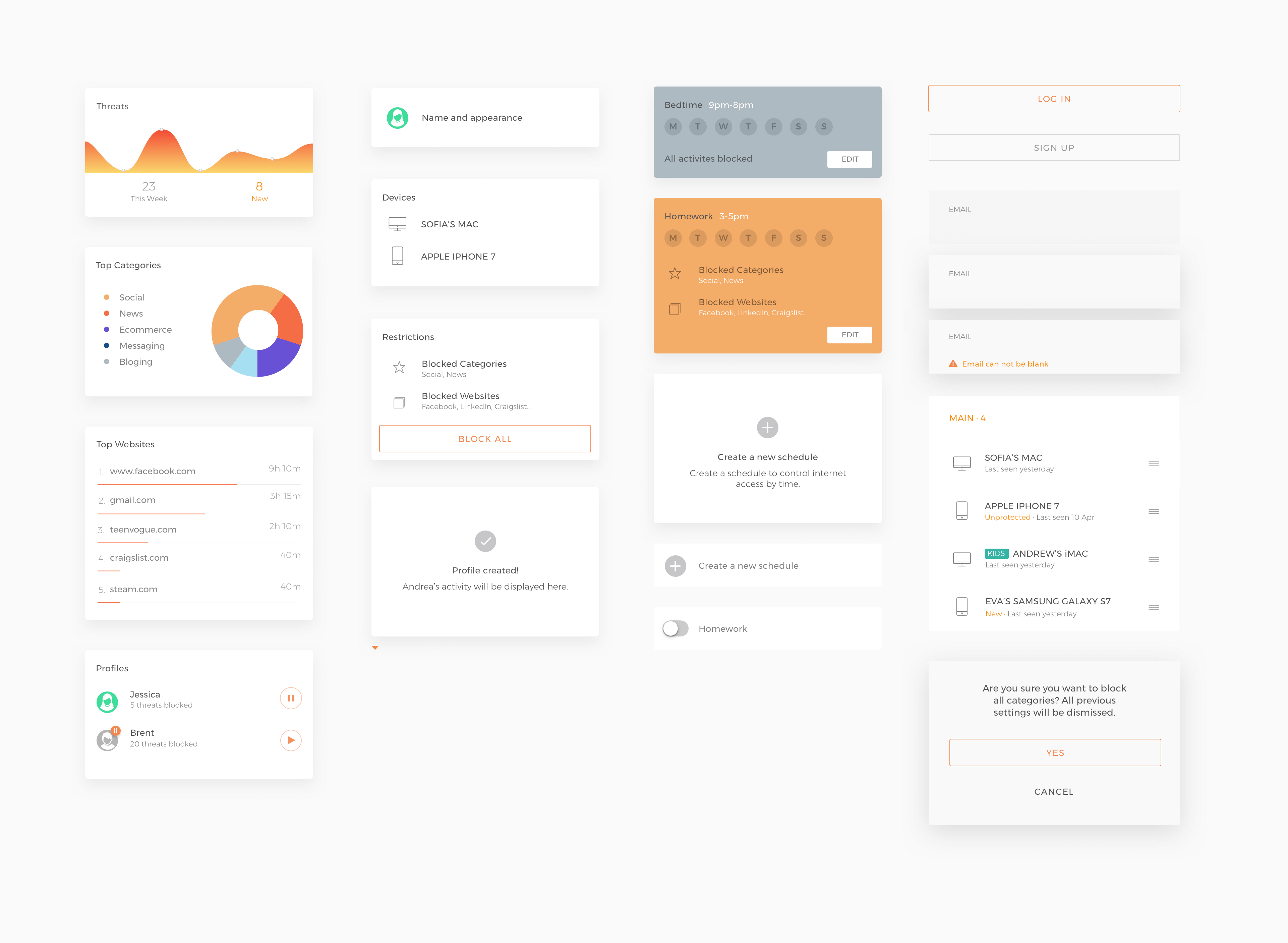
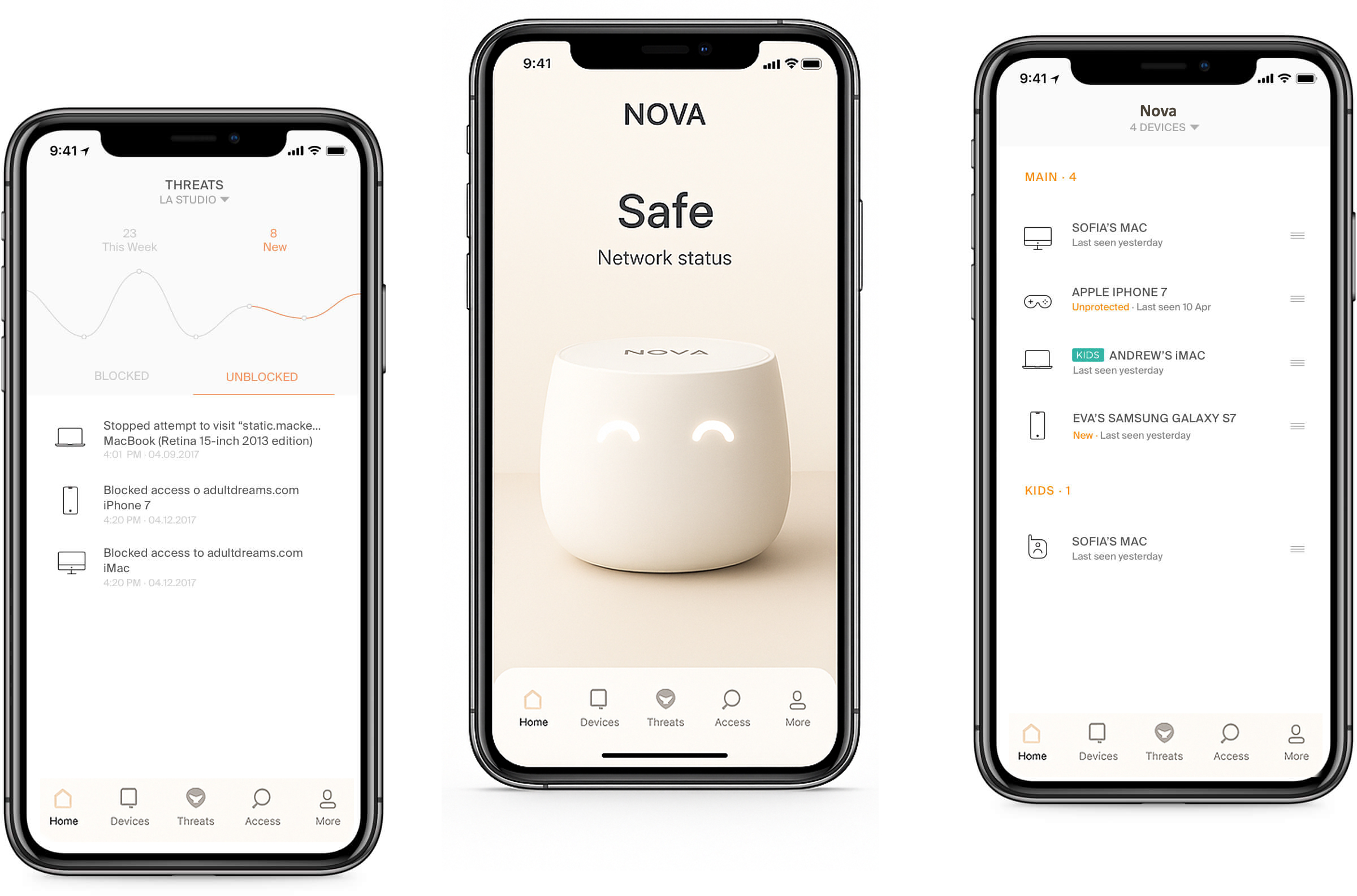
During research, users often expressed confusion about network health and device safety. We distilled their main needs into three clear questions:
1. Am I exposed to any security risks?
2. Which devices are currently active?
3. How can I manage what my children access online?
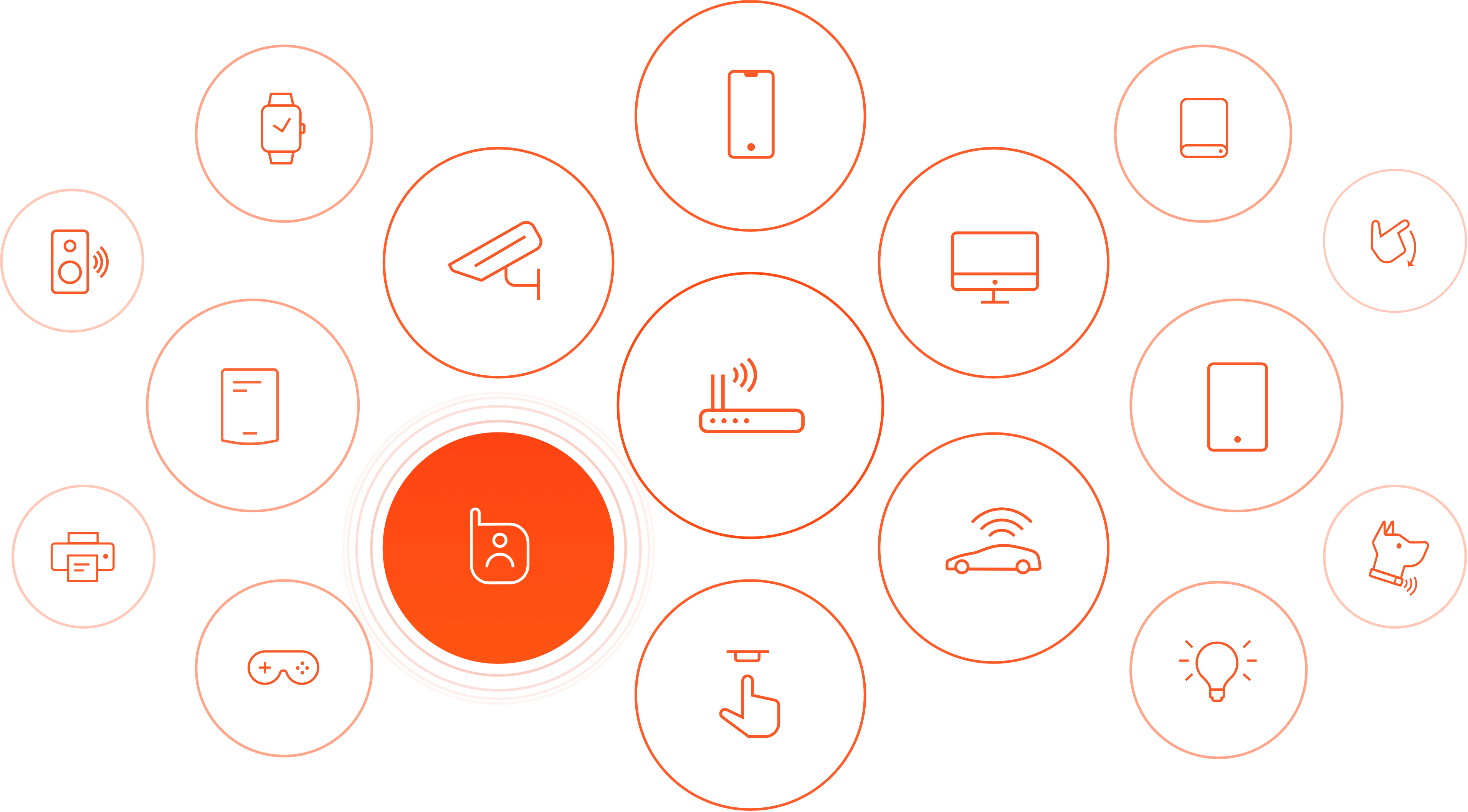
To solve this, we designed a modular app architecture based on tabs — each focused on a specific aspect of protection: Threats, Devices, Family, and Dashboard.
The dashboard used cards to summarize insights at a glance, making it scalable and adaptable for future updates.
Parents wanted a way to guide their children’s online experience without complexity. NOVA’s parental tools enable clear control over screen time, app categories, and schedules.
We introduced customizable time blocks for activities like “homework” or “sleep,” allowing effortless adjustments through a single tap.
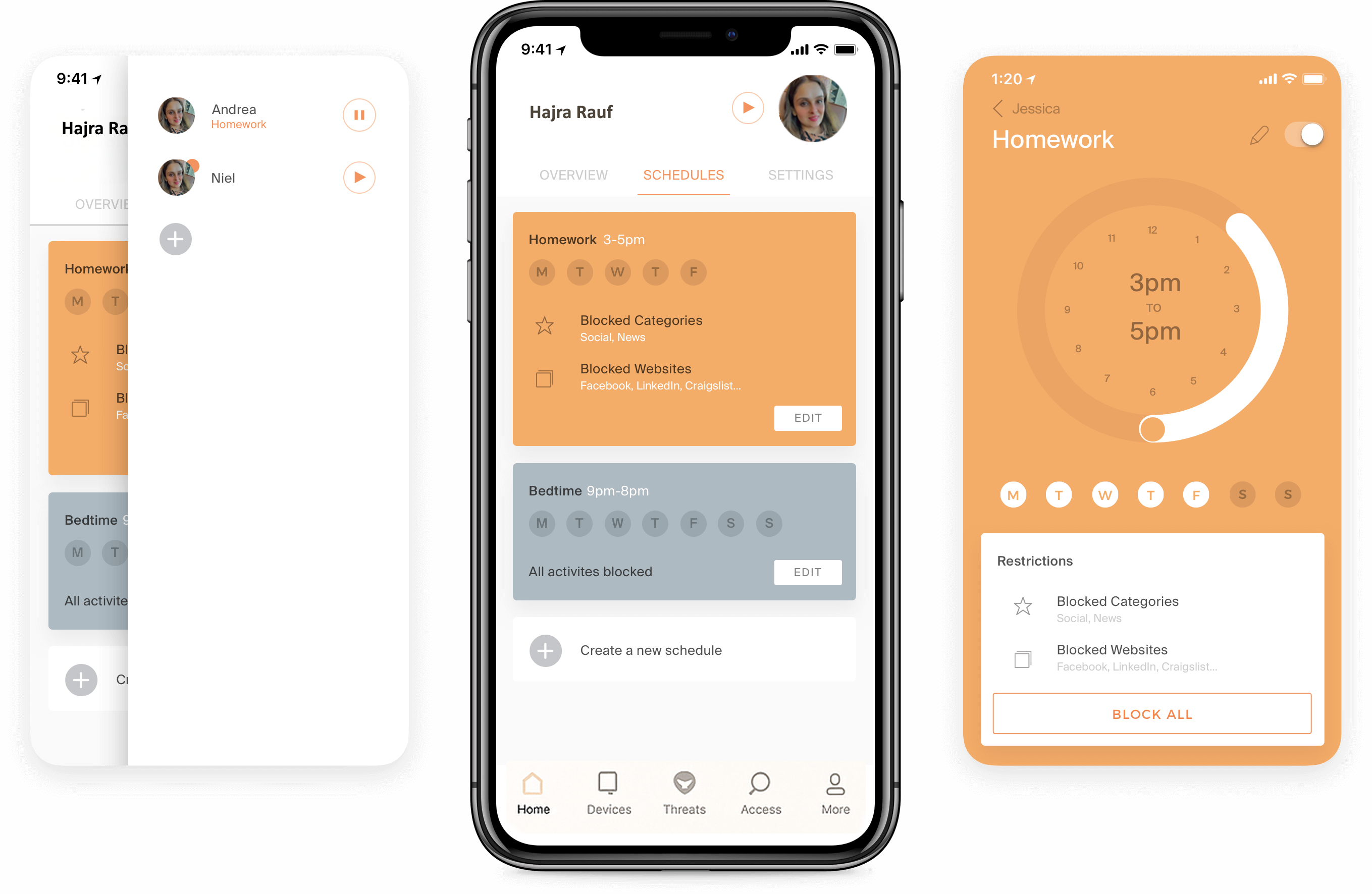
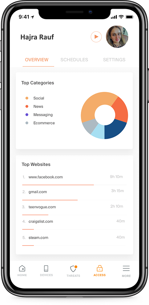
Beyond restrictions, NOVA’s dashboard helps families understand online behavior through transparent summaries of screen time, most visited sites, and threat alerts.
This not only increases engagement but also builds awareness, helping parents make smarter digital choices for their families.
With over 70 screens covering onboarding, setup, and advanced network management, the design system became the foundation of consistency and scalability.
Built on a modular component library, NOVA’s design system allowed faster iteration and ensured a unified look across every platform. Reusable elements like cards, lists, and buttons maintained visual coherence while remaining adaptable.